


Task 1–PACT analysis Mind Map for Hospital TV remote
Open PDF or PNG lightbox

Task 2–Understanding of 4 design principles
Four design principles as defined by Donald Norman’s book “The Design of Everyday Things”.
Visibility
Definition:–
An object's function should be visible so that people can see what it is currently doing and see what buttons or controls are available. Visibility can also be made available through the use of sound or through touch with for example different textures, shapes or vibrations.
The important thing here is that the visibility is recognisable rather than having to rely on recall.
| Example | Description |
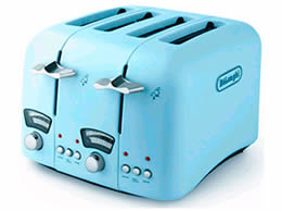 |
Toaster For this toaster in the picture the side handles that are used to lower the toast in front of the heating elements are up meaning that there is no toast in it. Clearly visible, from anywhere in the room. When the bread is placed in it the handles are pushed down and the top of the bread can be seen. More importantly, the handles are down, clearly indicating that the toaster is toasting so that the person can go about his/her business, making coffee etc. and occasionally glance over and see what is happening. When the toast pops up, so do the handles and the toast is half out of the toaster and usually the popping up action of the toaster is noisey. This noise adds to it’s visibility. It would be unwise for a toaster manufacturers to change this process because each stage of the toast making process is clearly visible and this is good because people like toast in the morning and they are not fully alert so the process has to be simple and the processes clearly visible. Image Source:http://www.appliancist.com/small_appliances/4-slice-toaster-delonghi.html last accessed 09.10.10 |
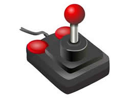 |
Joystick In the eighties with the rise gaming on home computers such as the BBC micro, the Commodore 64 and the ZX Spectrum there became a need for something other than the keyboard to control the game character on the screen. Using the keyboard was difficult. Which key makes the character go forward, which one for back and which ones for left and right, and then more importantly which one for shooting something?. Well actually the fire button was usually the spacebar which was the easiest to use. The image shows the archetypal joystick designed to solve these problems and replicate what gamers were using in the arcades. Moving the joystick makes it so easy that the gamer can now concentrate on getting immersed in the game. It also opens up the audience to a wider age range. For example the gamer’s grandparents and 4 year old brother can have a go too. The visibility is in the movements of the joystick. The movements do exactly what is expected to happen on screen. Image Source:http://commons.wikimedia.org/wiki/File:Joystick_black_red_petri_01.svg last accessed 09.10.10 |
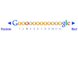 |
Google Pagination When conducting a search using Google there can be alot of results. At the bottom of the page below the first 10 results is the pagination. The pagination shows that there are more pages, shows which page you are on and that you can move to the next or previous page. The image shows that page 3 is being displayed, but it would be easy to jump to page 10 or back to page 1 by clicking on that particular number. This type of pagination has become a convention to replace incredibly long scrolling because what is happening and what is about to happen is incredibly visible. Image Source:www.google.com last accessed 09.10.10 |
Affordance
Definition:–
Design things so it is clear what they are for, for example on a website make buttons that look like buttons. Affrodance refers to the properties that things have (or perceived to have) and how they relate to how there are to be used. Buttons afford pressing, chairs afford sitting, and doors afford opening.
Affordances are culturally determined.
| Example | Description |
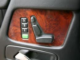 |
Mercedes Seat Control The seat controls for a Mercedes Benz car look like the seat. This arrangement of buttons could only be for the seat and nothing else. This is a great example of affordance where there can be no doubt to the driver what the buttons are for. Image Source:http://automobile.automotive.com last accessed 09.10.10 |
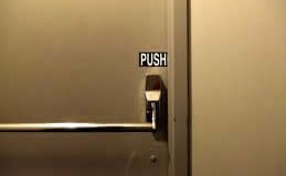 |
Door Push This type of door is usually used only in an emergency, for example in a fire. When this happens people are in a rush are stressed and may have others rushing behind them. With this level of affordance someone who misses the handle and bangs into it with their hip in the rush to get out will still open the door. This is affordance at the highest level where it is obvious what to do, object does it in a predictable way and even if you get it slightly wrong you have a successful outcombe. Image Source:www.vanseodesign.com last accessed 09.10.10 |
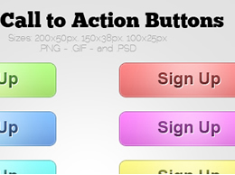 |
Call to Action Buttons Arriving at a website there can be nothing worse for a user than not knowing what to do next. Call to Action buttons must afford pressing. These brightly coloured buttons against the light grey background show up so well that a user would want to roll a mouse over them and in this case “Sign Up”. Attractive Call to Action buttons that are obvious to the user in their presense and outcombe will increase the profits of an e–commerce site. Image Source:www.design-freebies.com/free-icons/free-call-to-action-buttons/ last accessed 09.10.10 |
Feedback
Definition:–
Rapidly feed back information from the system to the user so that they know what effect their actions have had. Constant and consistent feedback will enhance the feeling of control.
| Example | Description |
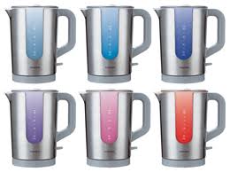 |
Kettle changing colour My own kettle has little switch on the side, that when I flick it down goes click and a red light goes on next to it showing that heating has commenced. It has a clear side so that I can see how much water is in it. As it heats up the kettle gets increasingly noisy, so much so that as it boils it can not be ignored and it fills the ceiling of my kitchen with steam. These are examples of good feedback and for most people and kettles that’s enough. The kettle in the image goes one step further and goes from blue when it’s cold through to red when it’s hot. This is a good safety feature for children, good for deaf people but may not so good for people with severe colour blindness but then I would hope the that other feedback methods of regular kettles have not been designed out. Image Source:www.coolest-gadgets.com last accessed 09.10.10 |
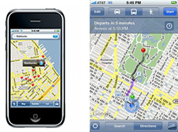 |
Google Maps If you are in an unfamiliar city Google Maps on the iPhone is made useful and fun because of it’s amazing feedback. Enter where you need to be and a route is mapped from your location, marked by a green pin, and your destination, marked by a red pin. As you walk or drive towards your destination a blue blob represents you. The blue blob moves as you do so you know immediately if you are going the right direction or veering off course. It works brilliantly because when the feedback is immediate. But because you are moving any lag in feedback due to low signal strength or similar technical issues, would show you in the wrong position and so would make the device unusable. Image Source: http://www.appcraver.com/google-maps-update/ last accessed 09.10.10 |
|
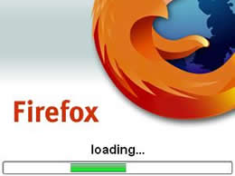
Firefox Loading Bar How do you know that you need to wait for a program to load? The loading bar of course. Without the loading bar nothing would be happening, and the user would wonder what was going on. The loading bar is the sort of feedback that indicates to the user, in the old days to make a cup of tea but now, open another browser window and check their email. Image Source:http://www.cyber-knowledge.net/blog/firefox-extension-splash-screen-with-load-bar/ last accessed 09.10.10 |
Mapping
Definition:–
Mapping is a technical term meaning the relationship between two things, the controls of an object and what that results in the real world.
| Example | Description |
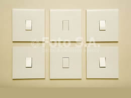 |
Light Switches The arrangement of light switches here could be confusing because they are not labelled but if they resemble exactly the arrangement of 6 lights that are on the ceiling or if they relate to display lighting on a wall in a shop then they have good mapping. Also important is the fact the each switch corresponds to one light or one light cluster, but there must be 6 lights or 6 light clusters that are divided up in 6 equal parts and arranged just like the switches with the 3 across and 2 down pattern. If extra lighting was needed and fitted in one of the 6 areas of the wall or ceiling then applying good mapping principles to the switches would mean the switch button or casing should be changed for one slightly larger than the rest to indicate the extra lighting in that area. Similarly if one of the lights in the 6 sections lighting was changed to a blue bulb, for example, then a blue sticker or dab of blue paint on the corresponding light switch would be good mapping. Image Source:http://fotosa.ru/ru/stock/search.asp?ID=1875308 last accessed 09.10.10 |
|
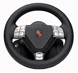
Porsche Steering Wheel Moving the top of the steering wheel towards the desired direction moves the car in the direction you want to go. So with the steering wheel rotating it clockwise the top of the wheel goes to the right and the car goes right, moving the steering wheel ant–clockwise with the top of the wheel moving left makes the car go left. The car driver must identify 2 mappings to go in 2 opposite directions. The choices are natural and closely relate to the desired outcome, plus provide immediate feedback. Simple mapping that takes seconds to learn to learn and remembered for a lifetime. Image Source: http://gearcrave.com/2008-11-03/fanatec-designs-porsche-steering-wheel-for-xbox-360/ last accessed 09.10.10 |
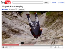 |
You Tube video progress/slider bar Every video on You Tube has a red progress bar at the bottom that moves from left to right during the play of the video. The bar's movement coincides exactly with progress throughout the video. So that if the bar is showing half way across, the the video is half way through, and if the bar has progresses two thirds of the way across then the video is two thirds done. It makes no difference if the video is long or short, it's always the same. For a longer video the progress bar just moves more slowly and for a short video the bar moves across more quickly. It makes no difference to the person viewing that for a given amount of movement this could represent 10mins in a longer video or 2 seconds in a shorter video. People see where the start of the bar is and where the end of it is and instinctively know what the movement of the bar represents. So much so they are able to move the progress bar with confidence knowing what will happen if they wish to replay a section of the video or forward on to a part they like. Image Source:http://www.youtube.com/ last accessed 23.10.10 |