![]()
Mini Project 1 – The Future of Interaction Design
1
| Scenario | Input | Output | Evaluation Method |
|---|---|---|---|
| Aalbert has not got the vest on | No input from vest | Audible – “Aalbert, please can you put on the vest so that I may help you today” Tone e.g. Friendly, bossy or Accents e.g. French, military, motherlyScreen – Vest Icon moving towards and then on a man icon (Lidwell et al 2010, p 132). |
Success Criteria being Aalbert puts on the vest in a reasonable time. For example 10 minutes. For Audio – But allowing for environmental factors, like room temperature and temporal factors such as time of day and day of the week, For example Aalbert may consider Sunday to be his day off and be very reluctant to put on the vest. Variations in Tone of voice and accent For the screen – Adjusting for physical factors such as Aalbert’s eyesight whether he is wearing or needs his glasses, level of colour vision. Variations in size of the icons, colour, and speed of their movement |
| Aalbert has watched an old film all afternoon |
Vest shows inactivity after a period of 90 minutes. In that time Aalberts muscles can become stiff making resist moving around. |
Audible – “Aalbert, you have had a nice rest, but can you now have a walk around, maybe time for a cup of tea so that your muscles don’t get too stiff”Screen shows impact of positive behaviour, visible and measurable (Deterding 2009,slide 84) Feeling better, moving around more easily, and negative effects of not, feeling depressed, achy muscles, | Success Criteria here whether Aalbert moves and walks around or not and how long before he does. Over the long term if the time he takes to start moving around is shorter then the exercise plan is working. |
| During Exercise | Vest shows increased blood pressure and heart rate. |
Audible – Kompai, monitors performance depending on Aalberts actions says encouraging sounds from “well done”, “nearly finished”, “try a bit harder”, and audience cheering sound giving Aalbert immediate feedback so that he knows that Kompai is monitoring his progress. Screen – Shows a progress bar along the bottom showing how far along in the routine he is which moves along faster if the vest shows that he has hit sufficient heart and blood pressure levels. Beyond the daily minimum required is a reward, points, cup of tea, food item. Points, nectar points, book vouchers, shop discounts, massage lady. Use of icons, making it graspable (Deterding 2009,slide 91).The choice of exercises showing a balance between Anxiety and boredom keeping Aalbert in the flow. (Csikszentmihalyi 2009) |
Criteria here could be to measure the increases in movement in response to different types of encouragement |
| Post exercise | Vest shows that Aalbert is recovering, heart rate and blood pressure returning to normal |
Audible – Kompai directs Aalbert to the screen where a graphical representation of progress is shown. Screen – Comparison of where he is now, and where he would be if he had not exercised. (Deterding 2009,slide 94) Making the wording personal . E.g.“Your” progress (Deterding 2009,slide 90) |
Criteria here could be whether Aalbert is showing progress, like for example a faster recovering heart rate. |
2
2a
Patient Consultation
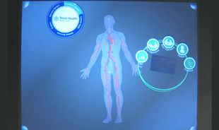
Source:http://microsoftfeed.com/2010/20-cool-apps-for-microsoft-surface/
[Last Accessed:19th Oct 2011]
Visual Display:–
Doctors have their own terminology and language. Very easy for a Doctor to discuss with another Doctor what particular condition is but difficult to explain to patients. Patients can be children, senior citizens or non–English speakers.
The Microsoft Surface enables a doctor to give more detail a lot faster and so a patient can understand better and feel more assured.
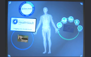
Source:http://microsoftfeed.com/2010/20-cool-apps-for-microsoft-surface/
[Last Accessed:19th Oct 2011]
Health Vault :– A problem with new condition and seeing a new doctor is that a patient would be worried that has doctor considered previous conditions and complaints. Having access to a full medical record means that the patient can refer to what he/she feels is a related issue, can point to it rather than have to remember what is was (Recognition over Recall (Lidwell et al 2010, pp 200-201)). Patient records are usually unavailable and it is given on trust that a doctor has reviewed them properly before recommending a course of treatment. With the MS Surface a patient can independently view their own records giving them a greater feeling of control.
Retail Banking
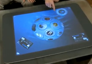
Source:http://microsoftfeed.com/2010/20-cool-apps-for-microsoft-surface/
[Last Accessed:19th Oct 2011]
Banking and related products are to most people boring. The playful, interactive nature of the application could mean that potential customers experiment with the application and inadvertently discover more about what the bank has to offer at their own pace and in a fun way, rather than having a bank employee explain it to them. The device would also help in priming the potential customer with the right sort of information so that when they get to speak to a bank employee they are already familiar with some of the services and products. According to Cialdini (1993) people who are more familiar with products are more likely to like them and so go on to buy them.
2b
Patient Consultation
Body Graphic:– Human Body graphic on the Microsoft Surface is the perfect example of mapping (Norman,2002,p.23) and used to great effect switching between skeletal, circulation and nervous system. With this the doctor is able to share with the patient his very accurate and detailed mental model (Norman,2002,p.17) of the patient’s body and condition.
ID Card and surrounding Icons:–
The Microsoft Surface has very fast feedback
(Norman,2002,p.27)
when the patient places their ID card on screen and good use of
iconic representation (Lidwell et al 2010, pp 132-133)
that surrounds the card makes the system easier to learn and content easier to find.
The icons are also large and around the where the card was placed which means according to Fitt's Law
(Lidwell et al 2010, pp 98-991)
the patient will make less mistakes when choosing an option.
The icons are also arranged close proximity
(Lidwell et al 2010, pp 196-197)
showing that they are related. Plus the icons are arranged in a circle because people have a contour bias
(Lidwell et al 2010, pp 62-63)
in that they tend to favour curved shapes over angular ones.
The icons themselves are very memorable because for the patient they a high prepositional density
(Lidwell et al 2010, pp 190-191)
For example the icon representing family history where the information behind it is considerable in the way that effects the patient like when there is a medical condition passed down through generations like sickle cell. This makes this icon very memorable.
The patient will be able to discuss their medical record with confidence because they can recognise relevant content rather than have to rely on recall. (Recognition over Recall
(Lidwell et al 2010, pp 200-201)
).
Medical records are can contain complex information the icons show a
hierarchical
(Lidwell et al 2010, pp 122-123)
structure where only necessary information is disclosed at any given time and this is using a design principle called Progressive Disclosure
(Lidwell et al 2010, pp 188-189)