![]()
Mini Project 3 – Information Visualisation
A
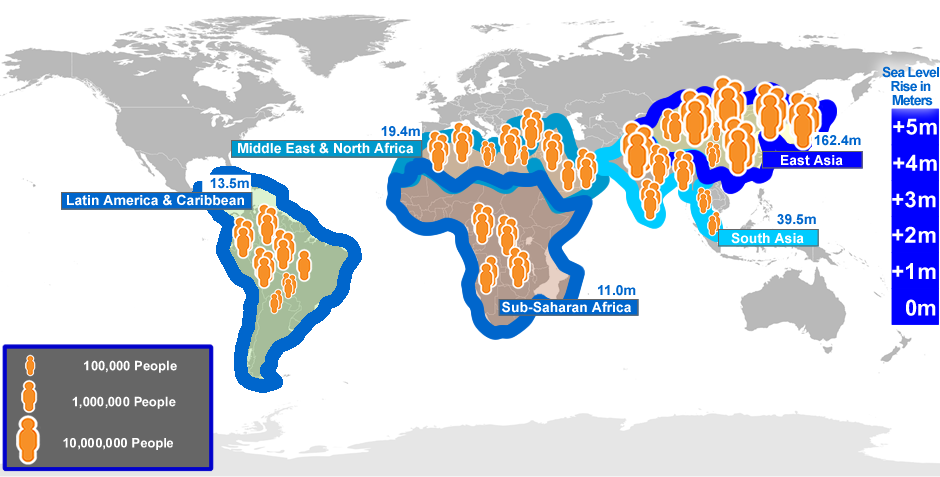
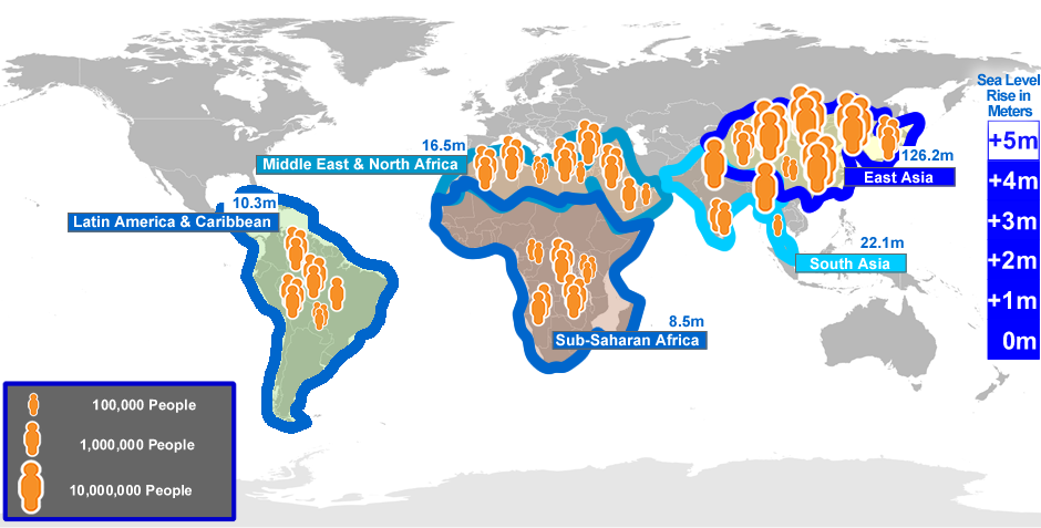
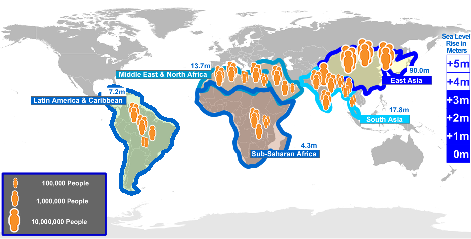
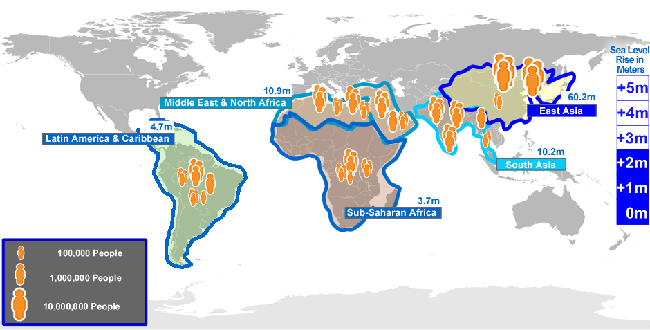
The World – Compare
The World – Explore
B
Discussion
Potential Audience
- Politicians
- Property buyers
- Environmentalists
For them the information must be quickly understood, be memorable and have sufficient impact that they act upon it.
Aim
According to Laumans to communicate the data in the most effective way the data visualisation must be quick, accurate and powerful. Quick to understand is especially important on the internet because people can move on to a website that presents the information in a better way(Krug, 2005). So important here is to choose a technique that minimises the burden placed on the users’ cognitive resources.
What needs to be communicated ?
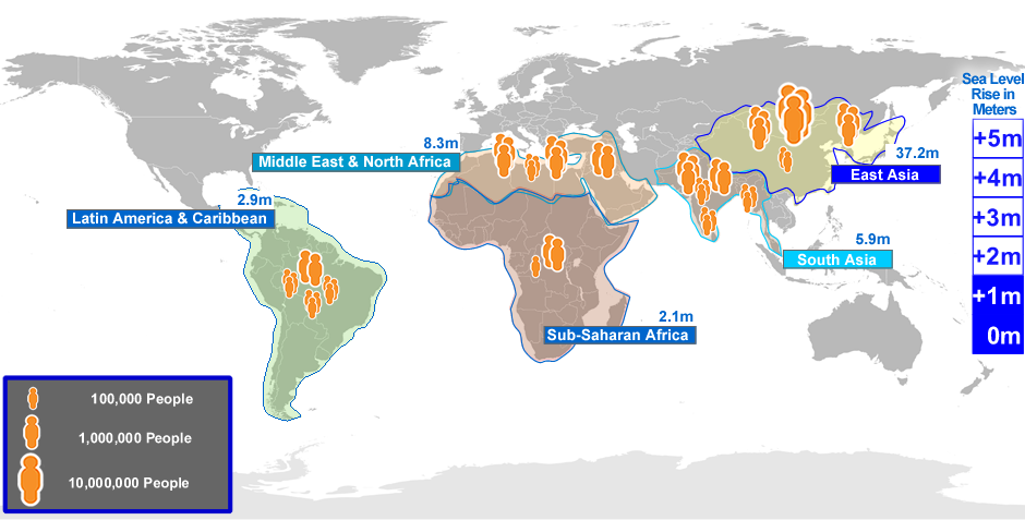
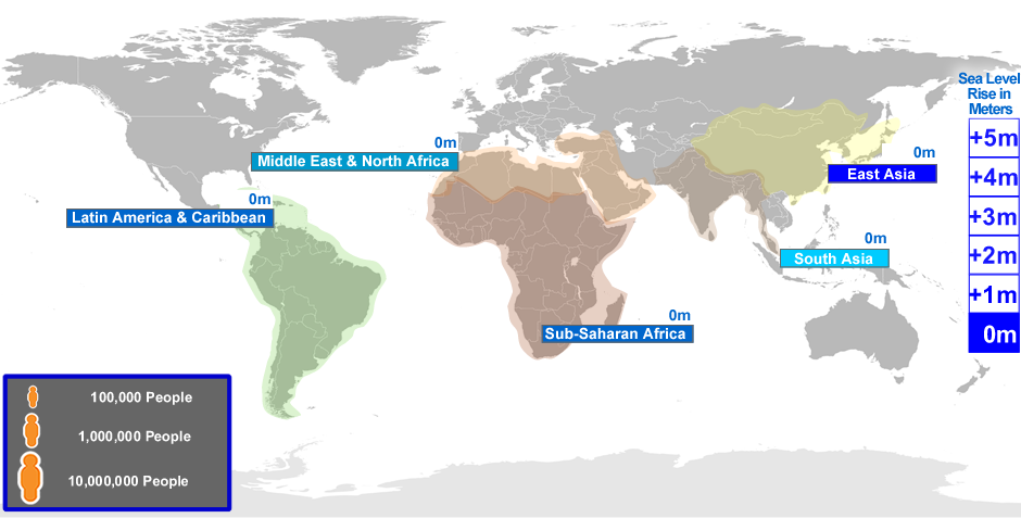
Fulfil Tufte’s criteria of show the data, be accurate, serve a clear purpose, encourage the viewer to compare different pieces of data. Users being able to see the impact of the different water levels while making a comparison between the different geographical areas.
Choice of Technique
The closest visual metaphor to the real world is a map (Norman, 1988,p.23) of the world and to represent the rising waters I have increased the thickness of the borders of these areas in blue (5 pixel increase per meter in water rise), different shades of blue to distinguish the different areas. Increasing the area border thickness is a representation to highlight that there is a difference. (Although local topography would mean that the water would cover different sized areas of land depending upon it’s height above normal sea level.) The use of blue representative of the water and I have repeated this in the area labelling (consistency).

I have used orange (complementary to blue(Sevilla, 2002,p.96) and non gender specific) icons that to represent the people effected and grouped in ways that are easy to count and representative of family groups to illicit and emotional response from the user. These are families being affected.
The contrast between the coloured areas and the greyed areas shows what the user should look at and what they should ignore and I hope this will be pre–attentive (Tidwell, 2006).
User Interaction
With the “Compare” model the tabs controlling the sea level are in close proximity, and are in a continuous vertical line, and are similar to the sea level indicator. The people icons are also enclosed with in the area boundaries clearly indicating that they are representing that area.
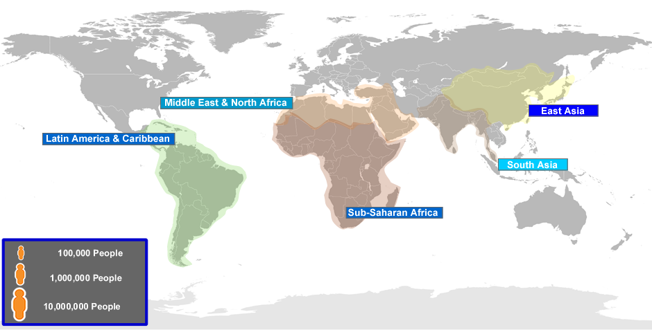
For the “Explore” model users have an opportunity to dig deeper to find out about each area in more detail.
Didn’t use
Standard data visualization patterns such as bar charts, line graphs, pie charts because they require the user extra processing and understanding and may even be put off by these types of representations. The aim being to reduce cognitive load not increase it.
Improvements
Find out more about the intended audience so that the relevant content can be highlighted and would use a cooperative evaluation method, and iterate before final publication. I could develop further the “explore” model to include more data.